What was this thing? A Scrolling Digital License Plate Frame.
The one I saw was obviously provided by the dealer because it said stuff about sales, service, oil changes, etc., and provided a phone number (I didn’t read it very closely).
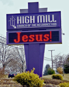
I have very mixed feelings about scrolling digital signs in general. Like anything, I guess they have their place. One thing for sure, I HATE the new trend in scrolling digital church signs…
Really.
Isn’t there enough neon tackiness in the world?
I mean, church signs are sort of an institution. I’ve grown rather fond of the standard church signs. You know, the ones with the interchangeable messages? They’re all pretty much the same size, so it’s almost like a haiku contest that never ends. Imagine the level of creativity required to come up with new and interesting sayings to fit a finite amount of space. I get a kick out of seeing what different churches come up with.
Here’s a site with 15 examples of funny, even edgy church signs for you. My personal favorite isn’t shown there, so I’ll just have to type it here. You’ll just have to trust me when I say I saw it on two different church signs, about a year apart, in West Virginia: Body Piercing Saved Our Lives. If you liked what you saw after following that link, check out this other site I found. But be careful, some are a tad obnoxious.
Anyway, it’s not the messages on digital church signs that bother me, it’s that digital church signs exist. If a church is on the strip in Vegas, that’s one thing. But rural churches sporting digital signs just bug me. Come to think of it, suburban churches with digital signs bug me, too.
It’s just more visual “noise” if you ask me.
I’d love to hear how others feel about digital church signs. Do you like them? Hate them? Perhaps they don’t bother you at all. Do tell. It’s always interesting to learn how the rest of the world thinks.

Hmmmm. I guess I never thought about it, really. I suppose digital signs specifically and church signs in general could be considered a way of keeping with the times and appealing to a new generation. If that’s the case, I guess it makes sense, but I also agree with you about the visual noise.
I totally agree – neon is just tacky (apart from Vegas, that’s all part of the charm). I had a good laugh at the funny church signs, but the other link had some scary stuff…
Do they have church signs like this in Belgium (digital or otherwise)? Or is just another American oddity?