Like the bumper sticker I attempted to photograph on the way home from WV last week. It was too dark and the image didn’t turn out very well, so you’ll just have to use your imagination. Graphically, it was rather bland, but the words made me laugh. It read, “I’m only speeding because I have to poop.” Had it said “shit” instead of “poop,” it would’ve been vulgar. I think the bumper sticker’s creator knew that. But then again, maybe he just got lucky.
Then there was the “gourmet market” sign at the local Safeway, which Hubby saw ages ago and Shannon also happened to remark about last week…

Shannon and I happened to be at the store together when she said something so I HAD to go snap a picture to share with you.
And the day a few weeks ago when I took my car to the garage to have some work done.
My first thought upon seeing what I’m about to show you was, “That thing is hideous.”
My second thought? “I’ll have to get some pictures for my blog!”
Some of you got a sneak peek in yesterday’s post. I find it pretty funny that only 20% of the commentors mentioned the picture I slapped at the end of yesterday’s post.
My Mom gets the honorable mention for noticing.
The thing I am referring to is this…
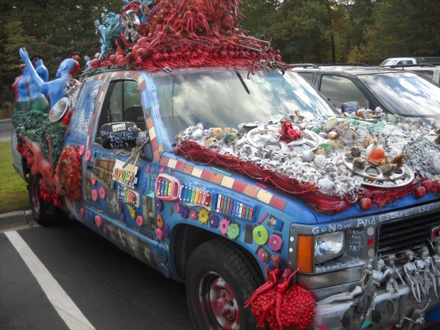
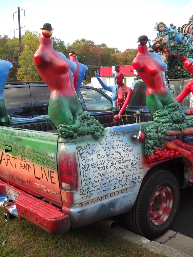
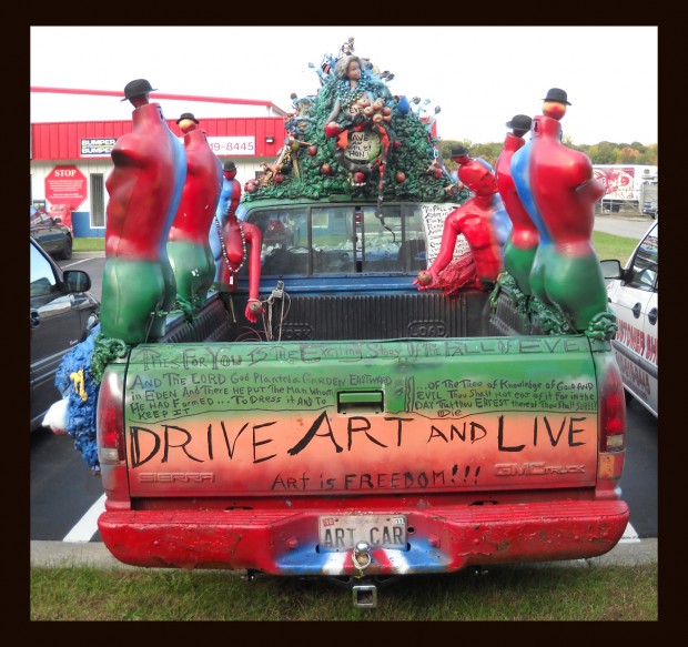
It’s an art car. The driver just happens to patronize the same auto repair shop that we use. Wikipedia has a definition for ART CAR in case you want to know.
I usually shrink images before uploading them to the blog. But I left all of these big so you could zoom in and get a better look. If you click on each image, it’ll pop up full-size in a window of it’s own.
Really, you won’t appreciate it at all if you don’t look closer and see all the clever little touches that make this thing fun. Like the xylophone strikers at the end of the rope fastened to each of the side-view mirrors. So admirers can actually play a few notes.
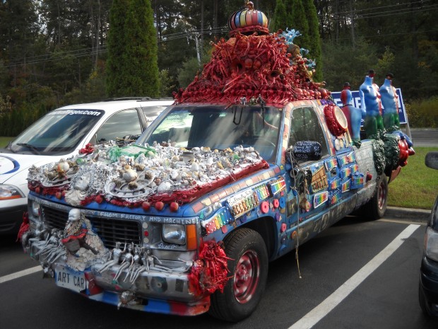
There’s a sign on the driver’s side that actually says, “Go Ahead Play the Truck.”
From a distance it is sort of hideous. But from up close, it’s sort of clever. At least I think so. Would I want to drive it? No. But I can appreciate the thought that went into the truck’s creation.
Like the little balls with hats atop the otherwise headless mannequins. Were they put there just to make it look more interesting? Or to symbolize something? The theme of the truck appears to be the Fall of Adam and Eve, so perhaps those tiny orbs symbolize their small-mindedness.
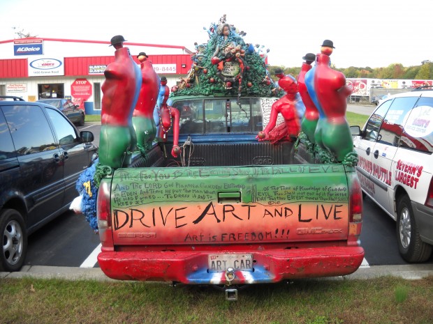
I like the “Have an apple, hon” that’s painted in the circle formed by a snake that sits on the truck’s roof. It’s right under that life-sized Barbie head. The “Hon” is a Baltimore thing.
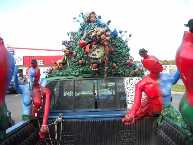
What’s with the female mannequin chained to the truck? And is that a Jägermeister miniature dangling from her necklace? The solar-powered lawn lights are a nice touch. As is the Woodchuck cider beer-tap handle.
The hood ornaments are sort of creepy.
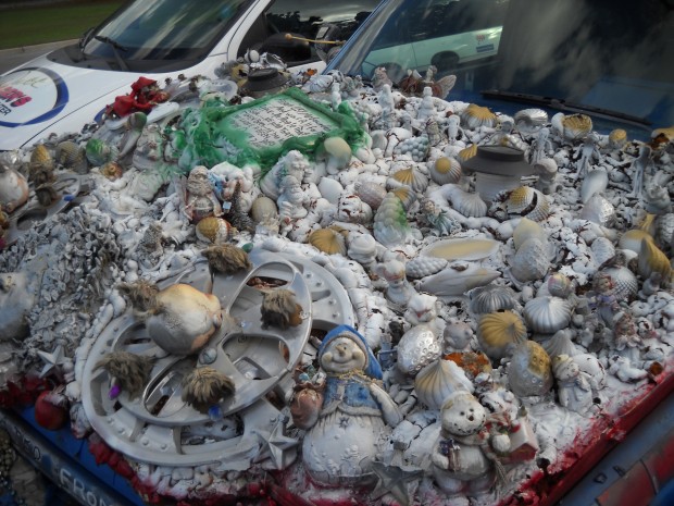
They are oddly reminiscent of the statues that adorn the Münster of Bern in Switzerland.
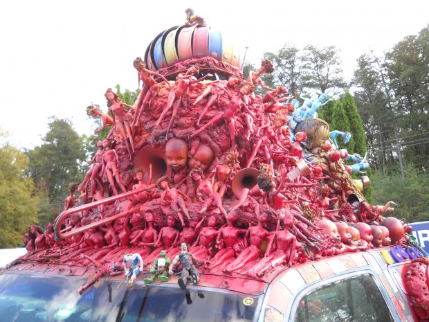
I’m not so sure I like the fact that the front of the roof ornament is covered in red. I do like the Power Ranger, headless Spiderman, Teenage Mutant Ninja Turtle, and G.I. Joe-type action figures that sit just above the windshield. The slide-trombone-cum-loudspeaker in the middle of the pile is cool. Although the babydoll heads to the right of that are sort of creepy. But cool-creepy like this ogre statue in Bern.
So what do you think? Is this art? Or just plain ugly? I’m curious, really.
